How To Create Watercolor-Like Text For Your Blog
I'm at it again today in Pixelmator, just playing around and trying to figure out how make things. Today, I've been playing around with how to make the cute, water colored text that I have been noticing is popular with bloggers these days. I personally LOVE the look of them, no matter how common they are, and have tried one on in the header.
Here's what you'll need: Pixelmator (or similar program). A font of your choice - I'm using Helena, which is a lovely script font. And lastly, something to write. I'm hailing from my 6 years of French here. This is super easy if you're a graphics pro already, but if you're not, then this is for you.
CREATE A CANVAS, 500px SQUARE AND WRITE YOUR TEXT IN WHITE.
ADD A BLANK LAYER ABOVE YOUR TEXT. THEN INSTALL YOUR WATERCOLOR BRUSHES.
I downloaded my watercolor brushes here and they come in several sizes and textures, from stroke to more blotchy ones. Download the zip file and extract the brushes. The file will end in .abr. Then you'll want to go back into Pixelmator. Double click on the BRUSH icon, which is green and highlighted in the toolbar above (the big one).
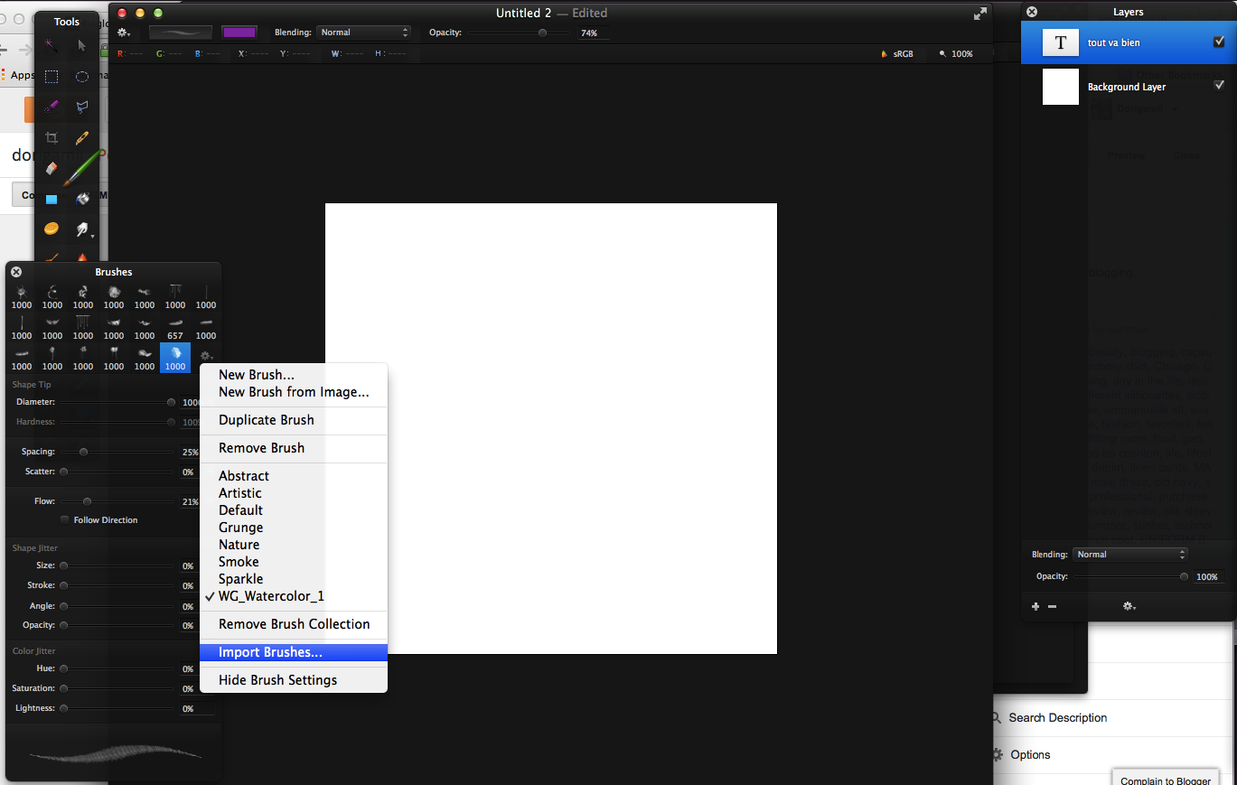
Then click on the gear icon in the top module in the bottom right, and scroll down into "Import Brushes...". This is where you'll want to double click on the .abr file. The new brushes will then be in the list in the same menu - here they're called WG_Watercolor_1.
THEN CHOOSE A COLOR AND START PLAYING WITH THE TEXTURES.
I chose a pretty purple color, and the brush from the set that I had installed - in case you're curious, it's the one right next to the gear. I turned down the opacity at the top to just 74% to get something more washed out, but still vibrant. Note that I'm working in a completely separate layer from the text! And that layer is above the text!
NOW CREATE A CLIPPING MASK.
NOW JUST THROW ON A LOGO, AND YOU'RE DONE!
You can mess around with the watercolor layer until you get the positioning you want, but other than that, you're finished! I threw on the blog logo I had created last night for good measure :)
Then - This is very IMPORTANT. You need to export this as a .jpeg file to get the best possible quality. PNG files will make it look a little noisy and dull around the edges. JPEG will ensure that the compression of this image file is lossless!
Hope this helps! Note that this isn't the only way to do it, nor is it the best way... I'm an amateur!


Ooh that's nifty. Also, the header is looking good!
ReplyDeleteThe new watercolor-texture header is very cute! I like the choice of light blue accent color.
ReplyDeleteBeautiful and so helpful! Thanks!
ReplyDeletexoxo,
Sarah
www.fashioncatapult.com
Your new header looks amazing! Can't wait to try and create some of my own water coloured text.
ReplyDeletehttp://beaudaily.blogspot.co.uk/
Great tip! I'll have to try this out.
ReplyDelete